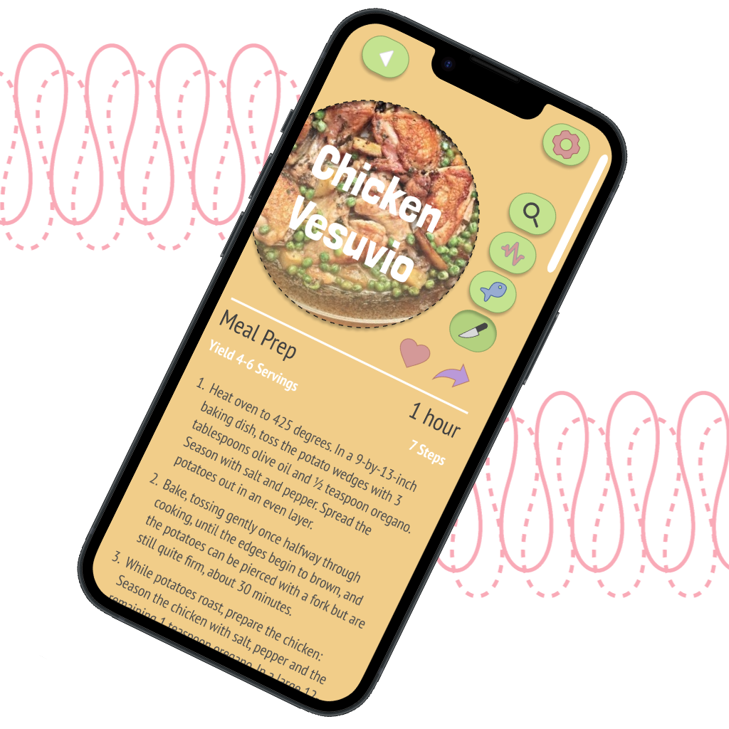
Just a few quick UI samples as a demonstration of some work. I will just spend a short few hours on these pieces. I like working with color and creating playful designs.
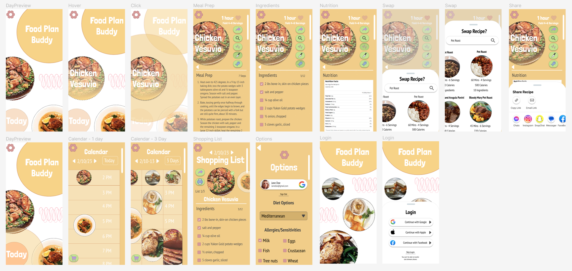
So I decided to play around and make some changes. Is it perfect? Nah, but I think it's fun and colorful.
Yeah, there are plenty of issues but for a quick concept, with a bit of an old-school vibe.
Yeah, yeah, too many fonts, a crazy amount but I did reduce them a little. At least it's just 2 families. Anyway, was a fun way to spend a few hours.
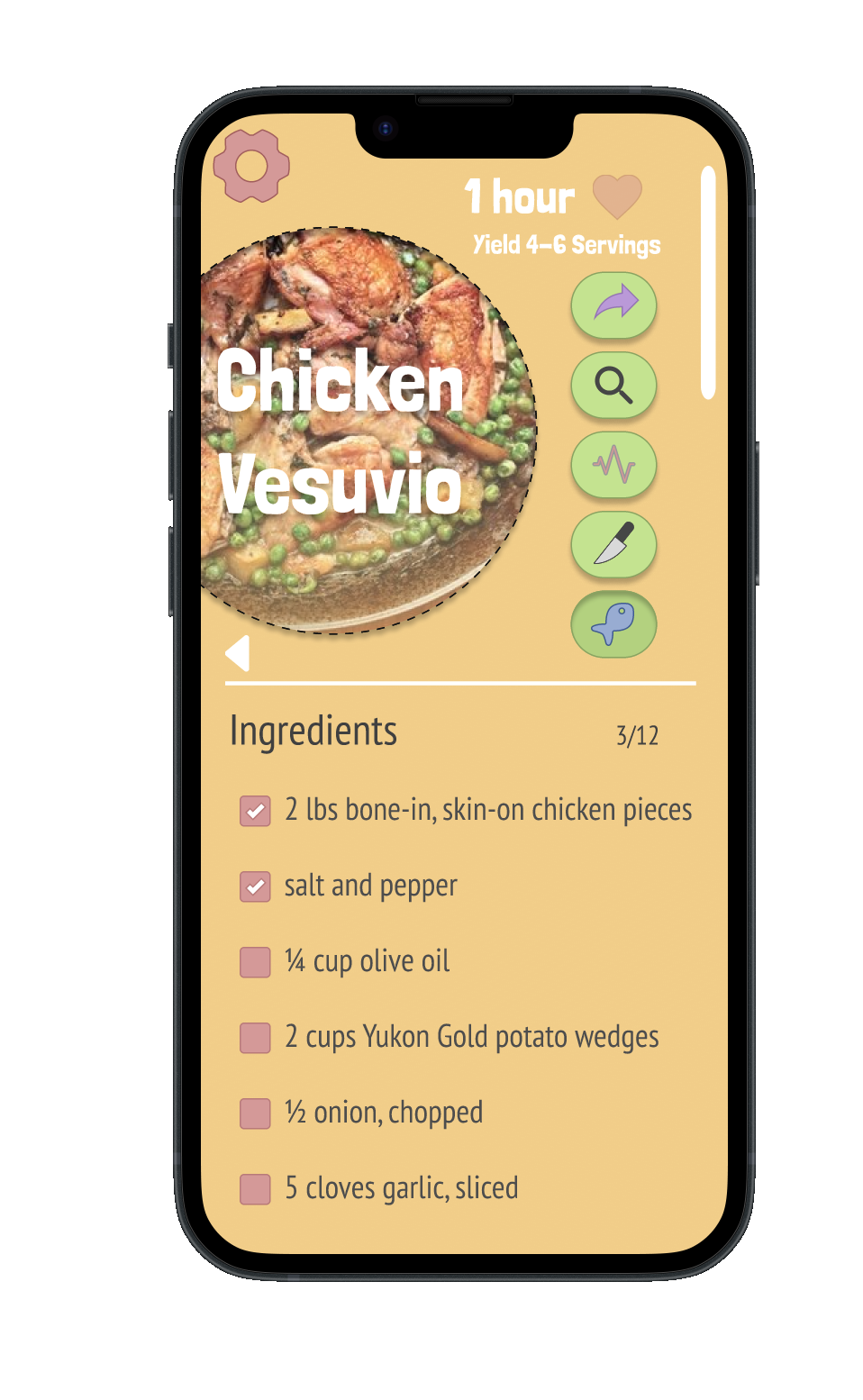
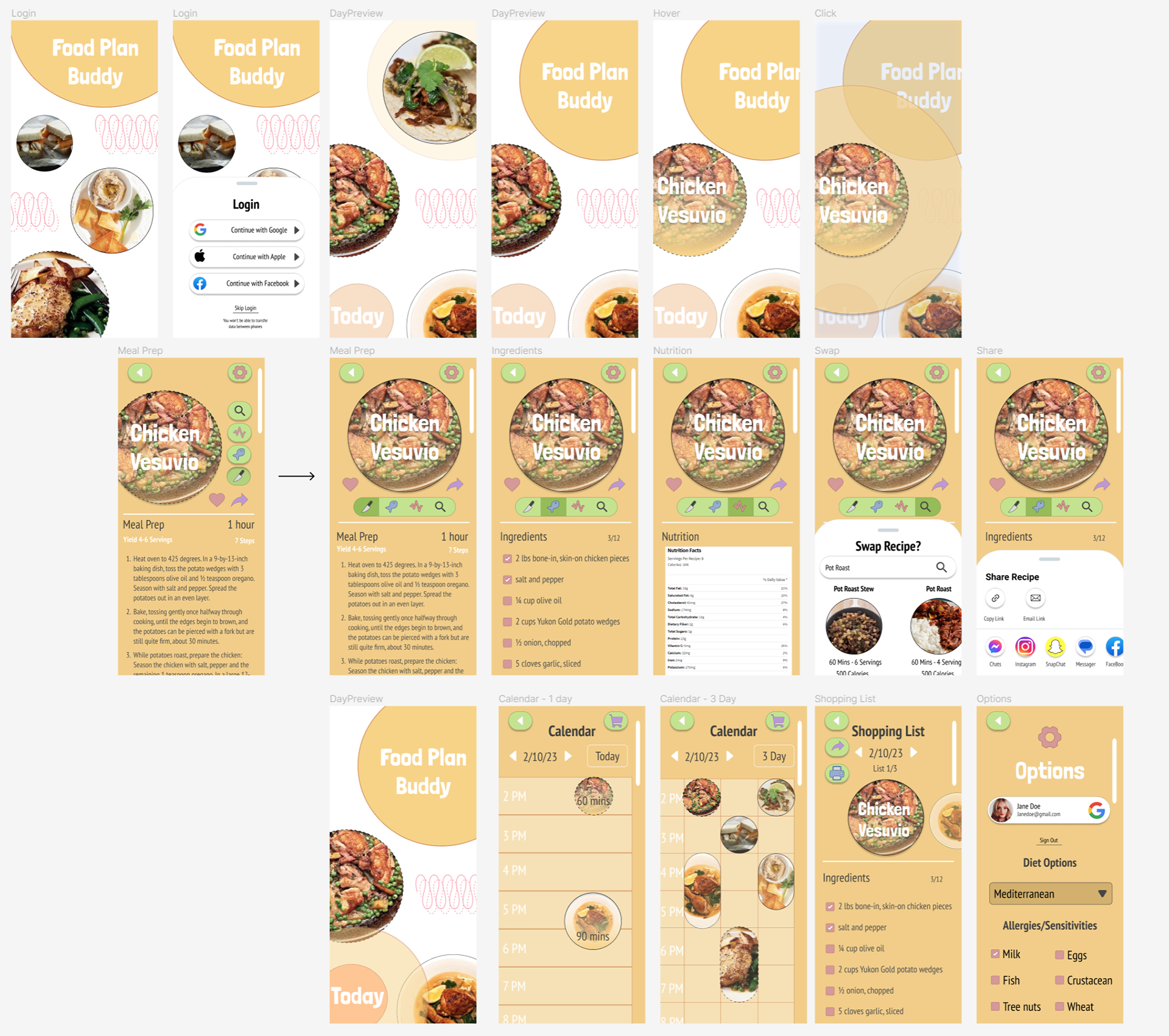
Yeah, there are plenty of issues but for a quick concept, with a bit of an old-school vibe.
Yeah, yeah, too many fonts, a crazy amount but I did reduce them a little. At least it's just 2 families. Anyway, was a fun way to spend a few hours.
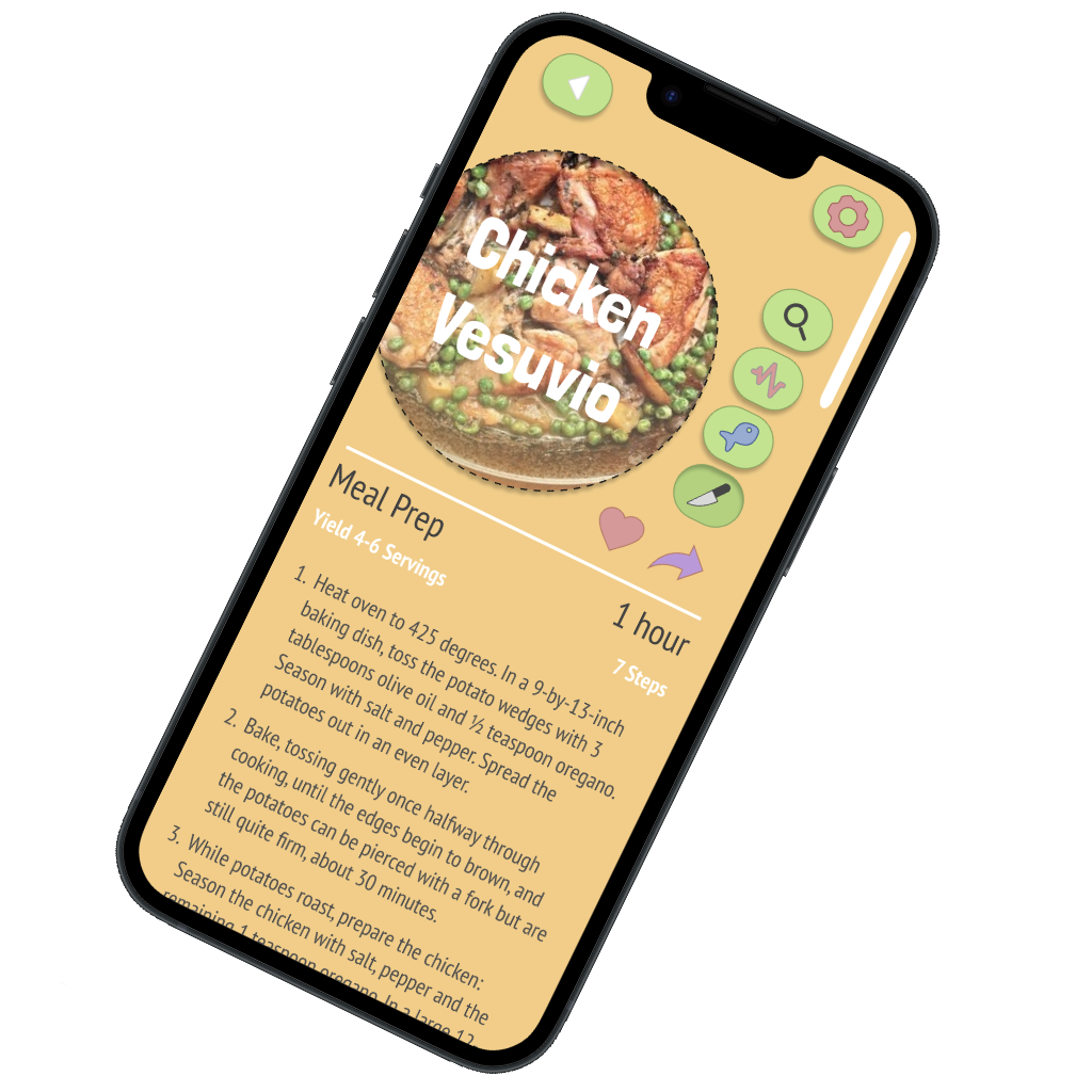
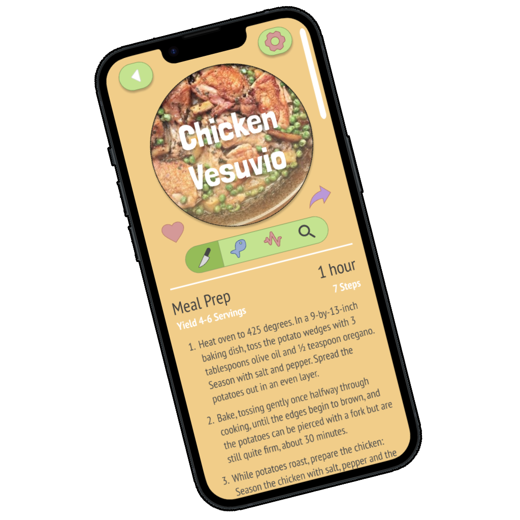
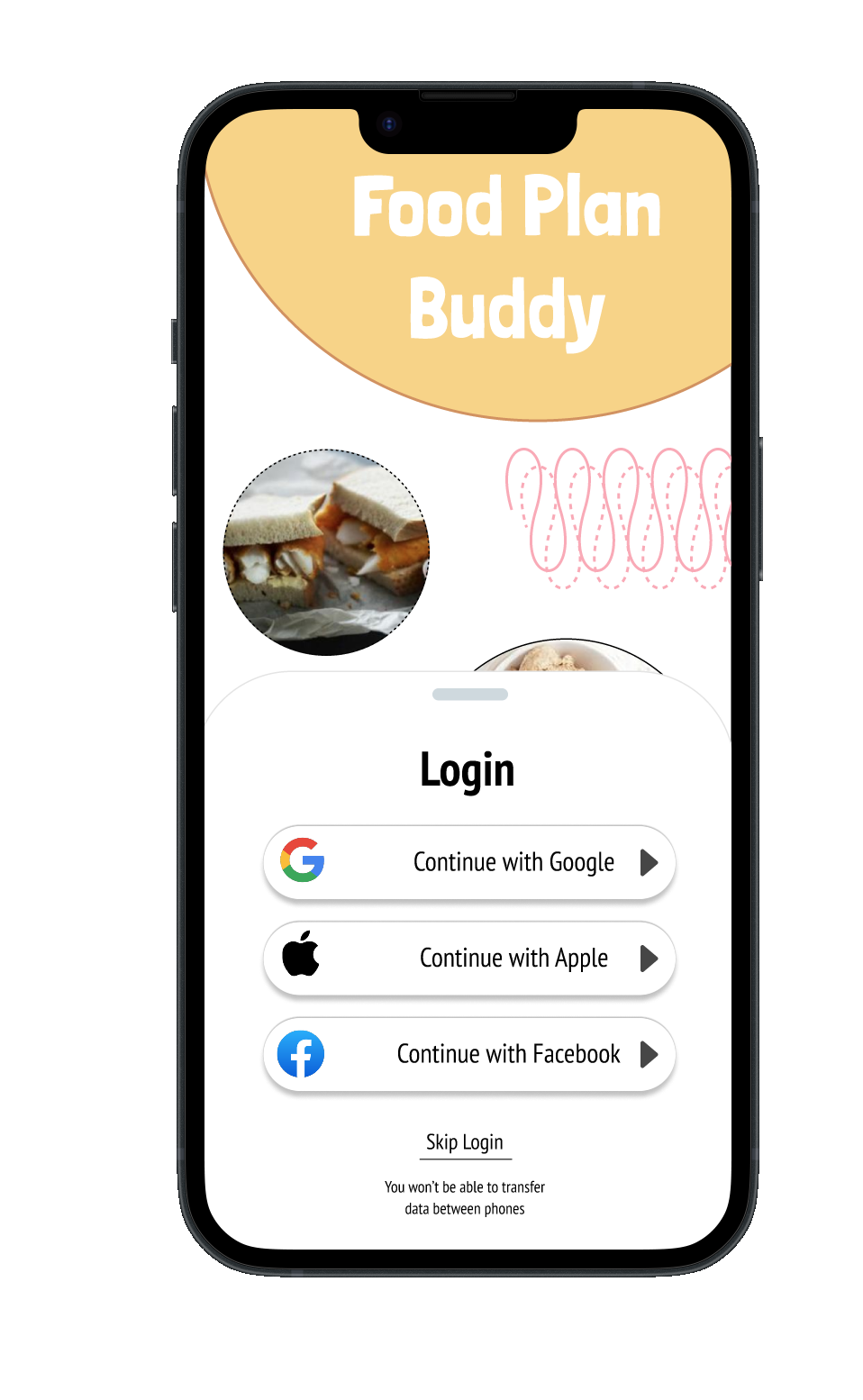
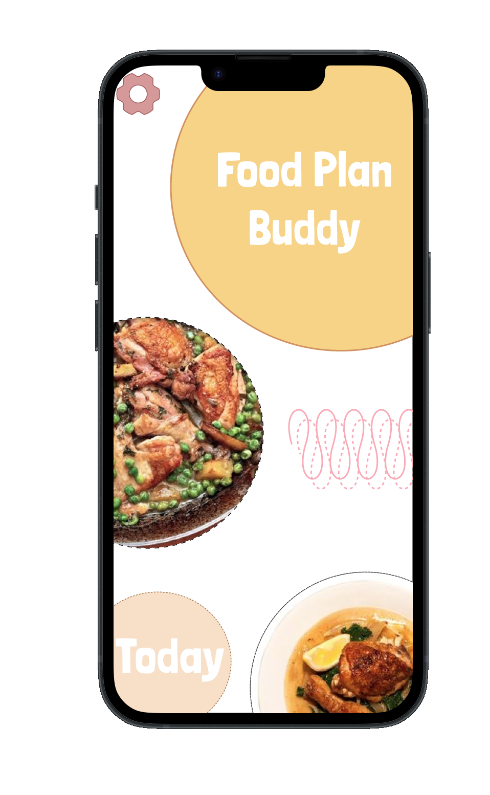
There was a big debate on which design was better, it was split between everyone I asked. I decided to just go with the simpler one. But I still rather liked the one on the left too.